This logo/emblem design was originally a variant on the Earth-as-a-tree concept that emphasizes our rootedness in energy from Sol, thus helping to explain the term SolSeed. It now accomplishes much more. For one thing, it could resolve the debate) about metaphors for members of the SolSeedMovement who prefer to focus on literal vs. metaphorical interpretations of TheDestiny: the latter represent the "Sol aspect" of the movement, while the former represent the "Seed aspect." (And of course some people are in between.)
I created three versions of the logo, from a very simple line drawing to a more "busy" but visually appealing graphic for posters.
Description Image (click for larger version) On the surface Closer look Deeper meaning
Basic emblem design, suitable for many uses and many media (ink, thread, wire, etc.)
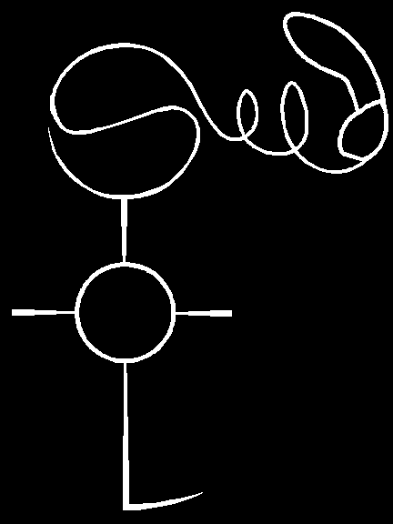
- The S is shaped roughly like a yin-yang symbol and could also be viewed as the ecology symbol, theta.
- The two e's trace the spiral path of a whirling maple seed.
- As noted above, the two words represent two intertwined aspects of the SolSeedMovement:
- SOL represents community, sustainability, centeredness, a focus on the present. It might be defined as the "feminine principle."
- Seed represents outward motion, material progress, change, a focus on the future. It might be defined as the "masculine principle" (the maple seed is even kind of phallic).
- Compare with the logo of the gender advocacy group Equality Now:

Four-color logo, suitable for using on fancy official documents and online, but still amenable to other media such as embroidery
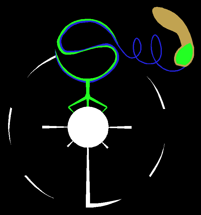
- The two S's in SolSeed are now shown in separate colors, but still intertwined.
- The S's also form part of a stylized tree growing out of the O representing Sol. (At least I hope that's obvious.)
- The new curved dashes, forming a circle beginning at the base of the L, represent the counterclockwise orbit of Terra around Sol.
- Color scheme:
- Green represents Life, of course.
- White represents the stable center and the cyclical patterns of the universe.
- Blue represents human civilization and its potential to create positive material change, the outward spiral that contrasts and complements the cycles.
- Brown represents the technology that, when placed in the service of Life, can make a wondrous future possible.
- Starting at the bottom of the S, humanity is on the outside of the circle, building on top of nature without seeing ourselves as part of it. By the time we reach the top, humanity is re-embedded within SolSeed, the body of all life.
Graphical poster version, to be printed on glossy paper and used to draw the interest of passersby. Could also be useful in animated videos.
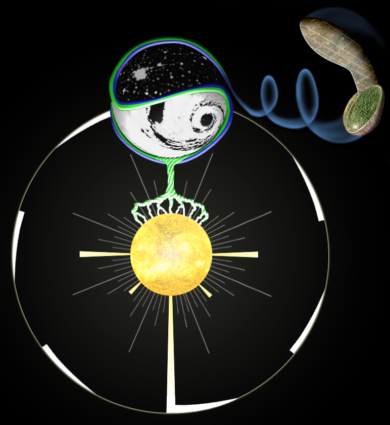
- To emphasize that the S represents Terra, I've added a sunlit swirl of cloud on the side facing Sol and city lights on the side facing away.
- With the extra "swoosh" on top, the seed-ship resembles a music note. Not sure if that's useful or not.
- The spiraling lines on the trunk represent the Upward Spiral of spiritual and moral progress necessary for us to become starfarers.
- The spiral of the hurricane-like clouds represents the inward spiral of spiritual self-discovery as described in The Untethered Soul--finding your consciousness/awareness as the calm eye at the center of the storm.